Event Style Guide MVC
Print Codes
* print-hide - Applied to a layout block, this will hide anything inside on print views. (I added this to the date control and the Expand All button on the schedule.)* print-only - Applied to a layout block, this will make it so anything inside will ONLY show on print. You could add a message that shows up on printed versions of the schedule.
Announcement Cards
A new alternative to the announcement cards is a List. To create this, first create a list of announcements you want to make by going to Content -> Lists in Sitefinity, and creating a list. In each item, fill out these fields:
- Title (the title of the item)
- Content (the big content area, will be displayed below title)
- Link (the URL you want the button to go to)
- Link Label (what you want the button to say)
- Primary Image (the image to the left)
Once you've created your list, all you need to do after that is drop in an MVC List widget, select your List, and choose the "Card carousel with count" template. See example below.


- Drag over a Column-100 layout. Under classes & labels, in row field put wrapper-carousel-one mg-carousel--single-slides. Label column 1 the announcements.
- Back under Content, drag over a Card MVC widget. Each card is one item in the carousel. Add the Heading, Text, Image, Call to Action label, and URL link.
- Expand the "More Options" section in the card's options and select the "Card, single slide" template.
- To add another card, drag over another Card MVC widget and fill in the items again. You can have as many cards to the carousel as you'd like and change the ordering of them.
- You might also want to add a title above the announcements cards.

Lorem Ipsum dolor
Lorem ipsum dolor sit amet, consectetur adipiscing elit. Proin vestibulum turpis eu accumsan sagittis. Nullam bibendum libero quis efficitur gravida. Aliquam vestibulum efficitur sapien, vitae rutrum nisi ultrices vel. Vivamus hendrerit lorem sit amet erat eleifend ullamcorper. Nullam nec posuere tortor. Nulla a hendrerit eros. Aliquam eu volutpat nibh, et mollis nisl.


Praesent in porta tortor
Mauris tincidunt diam ut dignissim ultrices. Duis nec tempor ante. Nullam commodo odio vulputate erat vehicula, vel dictum ligula porta. Donec sit amet mi massa. Integer tincidunt elementum elit, et tempus risus aliquam quis. Etiam sed ornare neque, at egestas odio. Etiam auctor placerat posuere. Phasellus ut placerat velit. Donec quis velit pulvinar, venenatis nunc non, porta eros. Duis dapibus erat urna, eu tempus arcu pulvinar nec. Donec molestie nec nisi sit amet pretium. Curabitur rhoncus fringilla lacinia.

Side Navigation Images/ Ads
- Drag in a Column-66-37 layout element.
- In the right column, drag in a Content Block
- Edit the Content Block and add your images. (Ads shown are 330px x 100px)
- Highlight the image and click on the hyperlink (globe with the chain icon) to link your image.


Cards
- Drag in a Column-33-33-33 layout element.
- Add container equal-heights section push-down classes to the Row.
- In each Column add card--black
- In each column, enter two content blocks. The top will be your title and the bottom your content. h3 is recommended for the title
Title
- Ignite valuable business relationships through networking and sharing best practices.
- Take home actionable solutions to problems that impact the bottom line.
- Gain valuable tools to drive sales, stimulate growth, improve controls and ensure compliance.
- Earn CPE credits.
Title
- Ignite valuable business relationships through networking and sharing best practices.
- Take home actionable solutions to problems that impact the bottom line.
- Gain valuable tools to drive sales, stimulate growth, improve controls and ensure compliance.
- Earn CPE credits.
Title
- Ignite valuable business relationships through networking and sharing best practices.
- Take home actionable solutions to problems that impact the bottom line.
- Gain valuable tools to drive sales, stimulate growth, improve controls and ensure compliance.
- Earn CPE credits.
Speakers Widget
- Insert a 100% Layout Element into an area of the page that spans the whole page width.
- For the wrapper set: wide-carousel banded-secondary section-inner
- Create the Speakers title by dragging in a 100% Layout Element into the previous layout element and entering centered in the wrapper and adding container to Column 1.
- For the speakers widget, drag in a 100% Layout Element as a sibling to the title area. Label the wrapper title and add container to Column 1.
- Within this layout element, drag in a Speakers widget (the one that doesn't have 'MVC' logo)
- Set the content by Categories and choose your event. Set the List Settings > List Template to Speaker Carousel. Set the list settings to 'No Limit and paging'. 'Use limit' is also okay. Save.
- Optionally, you can add a button under the speakers by adding another 100% layout under the Speakers 100% widget, label the wrapper component and use a content block into this layout widget.
- Paste in this for the button and replace the # with your link
<p style="text-align: center;">
<a class="button-secondary button--big" href="#" title="Speakers" target="_blank" rel="noopener noreferrer">Full Lineup</a>
</p>
Speakers
---2025-01-23t162833-373.png?sfvrsn=f4c35a73_1 "Untitled (480 x 600 px) - 2025-01-23T162833.373")


---2025-01-13t095115-720.png?sfvrsn=2fec0b51_1 "Untitled (480 x 600 px) - 2025-01-13T095115.720")

---2025-01-08t140011-000.png?sfvrsn=9112996e_1 "Untitled (480 x 600 px) - 2025-01-08T140011.000")


Matthew Perin
---2025-01-10t114339-054.png?sfvrsn=bc2fbd38_1 "Untitled (480 x 600 px) - 2025-01-10T114339.054")


Robert Moskow


---2025-01-09t140843-868.png?sfvrsn=f9f4097a_1 "Untitled (480 x 600 px) - 2025-01-09T140843.868")


Full Width Banners
Note: when the below refers to making two layout blocks "neighbors", you should make sure they're both part of a parent layout element, but not one within the other. The easiest way to do this is to label the parent element (the one you're dragging two into), so you can see two distinct layout blocks, one above the other. If you only see one box to drop content into they're probably nested.
- add a 100% layout block into an area without any containers/ layout elements to make sure it takes up the full width of the page and add js-check-content classes to the wrapper. Label this area 'Banner Area'
- add two 100% layout blocks into the layout block from the previous step (these two should be neighbors and not nested within each other)
- add a apply-hero-image class to the wrapper of the first layout block. Label this area 'Banner Heading'
- add banded-bright padded classes to the wrapper of the second layout block and add container padded--more js-check-me-for-content classes to the Column 1 field. Label this area 'Widgets here'
- add two 100% layout blocks into the 'Banner heading' area. These should also be neighbors and not nested.
- add hero-image hidden admin-display classes to the wrapper of the first layout block. Label this area 'drop an image widget here'
- add container gutter-top--big classes to the wrapper of the second layout block and add banded-bright padded--more classes in the Column 1 field. Label this area 'Banner heading'
- When adding the image widget for this area, you want to make sure it's at least a normal-size monitor's full width (so at least 1920px wide). The height is flexible, but keep in mind that it will push the page down if it's tall, so you ideally want a wide image that's not too tall.
- When adding a content block for the banner heading, you should use an h1 tag if you're using this to show the title of the page. If you're using it anywhere else, use an h2.

Page Title
Content / Widgets here
Image Carousel
- Drag in a 100% width layout and add a relative section class to the wrapper.
- Within this layout, drag in another 100% layout and add a component class to the wrapper. In Column 1, add wrapper-carousel-one collage-carousel
- For the images, drag in a content block into this component block and enter the following in the HTML tab of the content block. Treat each content block you drag in as one slide. In each slide, place three images
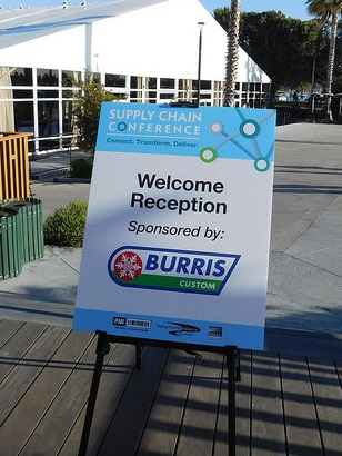
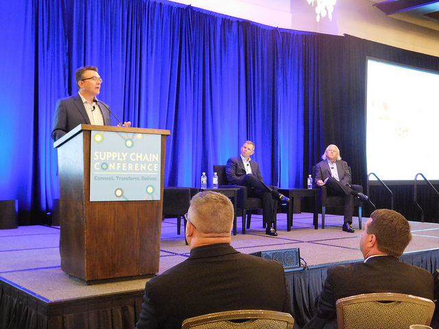
<img alt="replace" data-src="/images/default-source/supply-chain-library/supply_chain_conference_02.jpg?Status=Temp&sfvrsn=e42e706e_2" class="loaded" />
<img alt="replace" data-src="/images/default-source/supply-chain-library/supply_chain_conference_01.jpg?Status=Temp&sfvrsn=e62e706e_2" class="loaded" />
<img alt="replace" data-src="/images/default-source/supply-chain-library/supply_chain_conference_podium.jpg?Status=Temp&sfvrsn=1a2e706e_2" class="loaded" />- Please note, these are not normal image elements and will may not display an image properly while editing or previewing. Replace the links within the data-src quotes with your images (you can get the links to images by viewing the image in the Image library of sitefinity; you can also use links from another host). Replace the 'replace' within each alt with a descriptive title of your image. Recommended image sizes:
- Left Image: 308px by 410px
- Center Image: 807px by 457px
- Right Image: 514px by 386px
Horizontal Schedule Area
- Drag in a 100% layout. Add section to the Wrapper and container push-down to Column 1
- Drag in a content block for the title.
- Drag in an Events Widget (with MVC in the logo) underneath your title.
- In Content select your event.
- In List Settings, Use Limit -> 3 is enough. List template set to Events Session Horizontal List
06.05.19
5PM
Welcome & Industry Narrative: Transportation Imperative
Association leaders from FMI and GMA share an industry-wide perspective on the impact of transportation issues and solutions projects at all points along the supply chain and the collaborative relationships that will carry us forward.
06.05.19
5:20 PM
The U.S. Transportation Situation
Hear a macro view of the landscape of our federal transportation environment, including FMCSA efforts that offer the potential to create more jobs in the commercial motor vehicle industry while maintaining the highest level of safety.
06.05.19
5:50 PM
Treat Your Transportation Spend as an Asset and Build a Better Bottom Line
Too many shippers try to control the uncontrollable when managing their transportation costs. Within the uncertainties of today’s transportation environment, this session will help you unlock the value of investing in your transportation area as an asset, managing from the inside out, and controlling the things you truly can control to drive savings directly to your bottom line.
Horizontal Schedule Area - Specific Single Sessions
- Go to Layout --- click on Grid Widgets ----- Choose the grid 4+4+4 layout
- Drag in the grid 4+4+4 layout. Add section to the Wrapper and container push-down to Column 1
- Drag in a content block for the title.
- Drag in the Conference Sessions Widget
- In the Single Items Settings choose "Auto Generated Page" and then choose "Conference Single Form" under the Detail templates
- Go to the Content tab and choose "One particular conference session only" and select the conference session you want to show.
Event Agenda Set Up
Preparing the Conference Sessions Widget
- Log into the Sitefinity
- Click on the Content tab
- Go to Conference Sessions
- Enter:
- Title
- Start Date and Time, End Date and Time
- Content (this is what will display on the detail view page)
- Add Sponsor(s)
- This will replace adding the sponsor logos to the “Content” section above
- PRO TIP - Add a tag. Adding the same tag to all your Conference Sessions can help you sort through the larger database of Conference Sessions more easily. Be sure to use the SAME tag on each session for the schedule you are building. For example - 24 Legal and 2024 Legal are two different tags. Then when you're looking through all the Conference Sessions you can use the funnel icon and then custom filters and filter by tag to find the sessions related to your conference.
- Add Tracks
- Then publish the new Conference Track.
- You will need to go to Conference Tracks under the Content tab. Once open click on Create a Conference Track and proceed to give your new “Track” a title and an assigned hex code for color coding. You can also add a description for the “Track”. -
- **Adding additional custom “Tracks” for any event
that has 9 “Tracks” which are essentially event session types already added: Keynote, Breakout, Network/Social Event, B2B Meetings, Track 1, Track 2, Track3, Track4, Track5. Conference Tracks-You will see that there is a Content Type named - Select and add the desired Tracks for displaying in the Event Key and adding the color coding to the Event Layout.
are replacing “Categories” where you previously set the key color coding.Tracks - Add Speakers
-Under Related Speakers, add any speakers for the session (this might be something you come back and do at a later date).
- Then publish the Session
- Note: You can Duplicate sessions to save time. Duplicating copies over all the content and categories and you can make adjustments from there.
- Note: To filter by a specific event, use the funnel icon on the right-hand side of the page listing all the Conference Sessions. Click on Custom Filters and filter by Category for sessions Categorized by a specific event. (Please note, using this feature assumes that all the sessions have been properly categorized by those who entered the content originally)
How to Use the Event Widget
- After you have entered your Conference Sessions, go to Content and select Events.
- Note: You can duplicate an event to save time and make adjustments.
- Click the green Create and Event button.
- Enter
- Title (this does not get displayed anywhere)
- Event start date and time
- Event end date and time
- Time zone
- Speakers Page – enter the URL for the Event’s Speakers Page
- Schedule Page – enter the URL for the Event’s Schedule Page
- Under Related Data, click the plus sign and select the Conference Sessions for this Event. You can search for them by title or click on Show All Conference Sessions to see the full listing.
- Once you have added all the Conference Sessions for your Event, you can hover over the three vertical dots next to each Conference Session and a four way arrow should come up. This allows you to move the Conference Sessions so they are in the correct order.
- Publish the Event.
Adding the Conference Tracks and Event Widget to the Agenda Page
- Go to the Pages tab at the top of Sitefinity.
- Find the Schedule page for the Event you are working on and click to open the page.
- You will need to add both a Conference Tracks widget and an Events widget to the page
- You will find the Conference Tracks widget in the widget listing to the right under Conference Sessions – Add this ABOVE the Event widget on the page
- Click on Edit once open, under Content select “Selected conference tracks and add the tracks wanted for this event for example: Keynote, Breakout, ect.
- These will then display on the Key in the order that you have added them. You are able to reorder at any time by clicking on “Selected” and dragging them into your desired order. Click done selecting.
- Click on the List settings tab and under “Sort conference tracks” in the 1st dropdown select “As set manually” and in the 2nd dropdown select “Event agenda track”. Lastly, click on “Single item settings” and set the Detail template dropdown to “Conference Track”
- It’s very likely there is already an Events widget on the page. If so, Edit the Event widget.
- On the Content tab change the event selected to the new event. On the List settings check the “No limit and paging” and on the “Sort events” dropdown select, “As set manually” on the “List template” dropdown you will want to choose “Event agenda”.
- On the Single item settings select “Auto-generated page” and “Event details” in the “Detail template” dropdown.
- Click on Advance.
- Click on Model
- Change ContentViewDisplayMode field to say Master
- Click Save.
- The Event widget will update with your new Event Conference Sessions. You can preview the page and then publish.
- If your page is currently hidden, contact Nathalie, Bianca or Kelli to unhide the page. You can also use the website help form: http://intranet.fmi.org/WebsiteRequest
How to Use the Speaker Widget
- Go to Content and select Speakers.
- Note: You can duplicate a speaker to save time and make adjustments.
- Note: If a speaker is already in the system you don’t need to add them again. For example, Leslie Sarasin has been a speaker before!
- Enter:
- Title – the speaker name
- Bio
- Last name
- Title
- Related Images – add headshot. FMI Staff are sized to 125x125. Only need to resize if the file is very large. Be sure to save the image in an image file that makes sense—defaults to 2015 Community Outreach Awards (which does not make sense)
- Note: If a speaker does not have a headshot, use one of the headshot mock ups that is branded for the event. These are saved here:
- Under Related Data, choose the event the Speaker is speaking at. This can be more than one Event.
- Publish the Speaker
Update The Conference Session with the Speaker
- Click on the Content tab
- Go to Conference Sessions
- Find the Conference Session the Speaker is speaking at and open it. Remember the Filter feature to save time.
- Under Related Data, click on the plus sign and add the Speaker to the Conference Session.
- Click Publish
How to Put the Speakers Widget on the Page
- Go to the Pages tab at the top of Sitefinity.
- Find the Speaker page for the Event you are working on and click to open the page.
- It’s very likely there is already an Events widget on the page. If so, Edit the Event widget.
- Change the Event selected to the new event. On the List Tab check the No limit and Paging and on List Template select Speaker.
- Click on Advance.
- Click on Model
- Change on ContentViewDisplayMode field the value to Automatic
- Click Save.
- The Event widget will update with your speakers. You can preview the page and then publish.
- If your page is currently hidden, contact Nathalie, Bianca or Kelli to unhide the page. You can also use the website help form: http://intranet.fmi.org/WebsiteRequest
Creating Featured Speakers Section
- Drag in a 33% + 34% + 33%
- In the wrapper add container equal-heights section push-down
- In each of the three columns add card card--thirds
- In each card, drag in an image widget and select your image. Using the same size image across all three cards is recommended
- Underneath each image (while still within the card), drag in a 100% layout element and label the wrapper card_text
- Within this new 100% layout element, drag in a content block and/or an image widget and fill with desired content.
Sponsor Area
- Drag in a 100% layout block.
- Drag in a javascript widget. Click the "Write Javascript" tab. Enter this snippet:
window.supporterUrl = 'URL_HERE'; - Replace URL_HERE with the url to your sponsors page, while leaving the quotes
- Drag in a content block. Edit the block and click on "Advanced", scroll down to "CssClass" and enter sfContentBlock mg-thumbnails-wrapper--4-across
- Click back to the "Simple" view and under the html tab, enter this html:
<div class="logo-wall"> </div>
- Underneath the content block, drag in a Supporters (non-mvc) widget and select the category of your event. In List Settings, set it to "No Limit and paging" and set the List template to "For developers - Supporters Info"
- To add the What Your Logo Featured Here? Use this code in a content block and change the link highlighted in yellow:
<p style="text-align: center;"> </p>
<br />
<br />
<br />
<h4 style="text-align: center;"><span class="arrow-heading">Want your logo featured here?</span></h4>
<p style="text-align: center;">
<a class="button-secondary button--big" href="http://www.dailylead.com/fmi/index.jsp" title="Speakers" target="_blank">Become a Sponsor</a>
</p>
<p> </p>
Smaller Sponsors List
- To create a smaller sponsors list, simply drag in a Supporters widget (non-MVC). You can put this almost anywhere you'd put another content block, but you want at least half the screen or so to keep it from looking squished.
- Click Edit on the widget.
- On the first tab, click Selection of Supporters, and select the category you want to filter by (usually Events > Name of Event).
- Under the List Settings tab, select a limit (if you only want to display a limited number of sponsors) or select "No limit or paging" to show all sponsors that fit your category.
- Optionally, in the sort dropdown, select Title (A-Z) to alphabetize your sponsors.
- Select a list template from the last dropdown. You want one of the options that looks like this:
mg-thumbnail-list--5-across
The number in the template you select will be how many columns are used, so try to set a good amount for the amount of space you have and/or the number of sponsors you have. (e.g.: don't choose 5 columns if you're displaying in a very small space; don't choose 4 columns if you have 9 sponsors since you'll have one on a row all its own.)


-(58).png?sfvrsn=2ce33788_1 "Untitled (500 x 200 px) (58)")


-(70).png?sfvrsn=51521f60_1 "Untitled (500 x 200 px) (70)")
Setting up the Attendee List
- Add a 100% layout block to the page.
- Add the container class to Column 1.
- If you don't have a header image or text above, add the section-2x class to the wrapper. You'll likely want at least a content block with an h1 element and the page title here.
- Drag in a content block for the attendees list to use.
- In the content block, switch to the HTML editor paste this text:
<div id="pull" data-meetingid="442BBE00000008"> </div>
- Change the number assigned to data-meetingid to the ID of the Maxx meeting that you wish to show the attendees of. Make sure you leave the quotes intact.
Curation Tiles
Drag in a 100% width layout and add a banded-bright section-inner class to the wrapper and a container class to Column 1.
For creating a block-like treatment, first look at the number of rows you need (rows being dictated by complete lines of white space that span the entire treatment). Then, for each row, choose either a 33%+67%, 67%+33%, or a 33%+34%+33% layout element. In any case, name the wrapper class tile--banner .
In each column drag in a Tiles widget (under Curated Tiles, non-mvc). Chose to display 'one particular tile only'. Under Single Item Settings/ Detail Template, select Matrix - Single Tile. Small and medium tiles are reserved for columns of 33% or 34%, while large tiles are for 66%. Small tiles can be stacked in the same column.
Since 100% can't be divided three ways evenly, some alignment issues can arise. When creating this treatment, choose one column to apply the extra 1% to and stick with it throughout every row.
Small: 370px x 220px
Medium: 380px x 450px
Large: 760px x 450px
Font Sizes
Heading 1
Heading 2
Heading 3
Heading 4
Heading 5
Heading 6
Normal Text
Navigation
When using a navigation widget:
- Go into the widgets' advanced settings
- For the SiteMapProviderName option set: CustomSitefinitySiteMap - Setting this option will enable protected pages to display in the navigation.
Horizontal Lists
add a list-across class to a list to make it display horizontal.
- I am a list item
- I am also a list item!
<ul class="list-across">
	<li>I am a list item</li>
	<li>I am also a list item!</li>
</ul>
add a list-across-divided class to a list to make it a divided horizontal list.
- I am a list item
- I am also a list item!
<ul class="list-across-divided">
	<li>I am a list item</li>
	<li>I am also a list item!</li>
</ul>
Buttons
<ul class="list-across">
	<li><a href="#" class="button">Hello world</a></li>
	<li><a href="#" class="button-secondary">Hello world</a></li>
</ul>
To make buttons bigger add a button--big class.
<ul class="list-across">
    <li><a href="#" class="button button--big">Hello world</a></li>
    <li><a href="#" class="button-secondary button--big">Hello world</a></li>
</ul>
Text size options
This is some normal text. This is some normal text. This is some normal text. This is some normal text. This is some normal text.
Use a small-text class for some small text. This is some small text. This is some small text.
Use a medium-text class for some medium text. This is some medium text. This is some medium text.
Use a large-text class for large text. This is some large text. This is some large text.
Use a larger-text class for some larger text. This is some larger text. This is some larger text.
Use a largest-text class for the largest text.
Layout - Max width wrappers
This layout column has a max width (the content within does not strech to the edge of the browser on wide viewports).
Use a container class on a layout column to apply the sites' standard max width restriction.
This layout column has a more comfortable reading line length.
Add section to the wrapper and container and reading-container class on the same column to shorten the max-width restriction.
This layout column is more narrow.
In addition to the container class, also use a reading-narrow class on the same column to shorten the max-width restriction.
This layout column has the most narrow max width of all.
In addition to the container class, also use a reading-slim class on the same column to shorten the max-width restriction.
Layout Spacing
I've been pushed down.
Divided columns
Drop in a multi-column layout block and add a divided-columns class to the wrapper.
Add a equal-heights class if you want the columns to appear equal in height.
Add a center-inside class if you want the content within the columns to be vertically centered.
"Banded" areas
The default background of the site is a light gray color.
Mobile Display
If for some reason layout elements don't stack on mobile - add a mobile-zero class to the layout element.

Responsive Embed
Media Box


Secondary Media Box
Drag in a two column layout and add a media-box--secondary class to the wrapper.
This variation of the media box is intended to span the width of the screen, so make sure that you don't set this up inside another layout area with a max width.

Call to action
Add a two column layout block and add a call-to-action class on the wrapper.
Do something
Equal Columns
If you are using two columns put a equal-heights class on the main wrapper layout block. This will stretch the background color of both columns so that the columns appear even in height.
Do somethingBlog Cards
Drag in a 100% column layout. Add a section-2x class to the wrapper and add container in Column 1.
Into this layout element, drag a Blog Posts MVC widget. Select "Use Limit" and set to 3 items total. Choose "Matrix blog post cards" as your "List template."
In the Single Item Settings, under "Open Single Item In...", choose Selected existing page > (Voice of Food Retail Blog) > View
Use a Content Block with text (in H3 & Strong) for the heading and put it right above the blog card content.
To add a button to the blog below the cards, add a Content Block there and copy this HTML:
<p style="text-align: center;"><a href="/blog" class="button" sfref="[f669d9a7-009d-4d83-ddaa-000000000002]eabdcb02-24aa-6724-9237-ff0000c12749">Read our blog</a></p>
Blog posts heading
News Cards
Drag in a 100% column layout and add a section-2x class to the wrapper and container in Column 1.
Into this layout element, drag in a News MVC widget. Select "Use Limit" and set to 3 items total. Choose "Matrix news cards" as your "List template.
In the Single Item Settings, select existing page > Newsroom > Latest News > View
Latest News
New FMI & NielsenIQ Report Explores Grocery Shopping in the Digital Age
Report Finds More Than 90% of Shoppers Now Purchase Groceries Both In-Store and Online
ARLINGTON, VA — As grocery shopping enters a new era of digital transformation, FMI—The Food Industry Association and NielsenIQ (NIQ) today released their new report, Digital Engagement Transforms Grocery Shopping 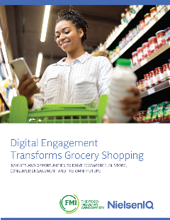 , which premiered at FMI’s Midwinter Executive Conference. The report finds that today, more than 90% of shoppers participate in both online and in-store shopping.
In 2017, FMI and NIQ predicted that by 2025, digitally engaged grocery shopper spending would reach $100 billion or 20% market penetration. This year’s report reveals that those projections were met and exceeded, with the latest FMI/NIQ projecting total U.S. online sales for grocery items to reach $388 billion or nearly 25% market penetration by 2027. It underscores the growing influence of digital tools – from ecommerce platforms and retailer apps to social media and AI-powered personalization – on the modern-day grocery shopping experience and illustrates how the COVID-19 pandemic contributed to the rapid adoption of omnichannel shopping.
“Consumers are seamlessly blending in-store and online experiences to meet their needs,” said Chief Collaboration Officer and Senior Vice President of Industry Relations for FMI, Mark Baum. “Our research underscores the urgency for food retailers and manufacturers to adapt to this omnichannel reality and leverage digital technologies to enhance convenience, personalization, and trust. Trading partners need to meet consumers where and how they want to be met."
“Digital engagement is no longer a complementary strategy, it’s essential to growth,” said Kim Cox, managing director, Omnicommerce at NielsenIQ “With online food sales projected to reach $388 billion by 2027, retailers and manufacturers must prioritize ecommerce and social commerce strategies to meet the expectations of digitally connected consumers.”
Other key findings of the report include:
- Online Sales Growth: Online sales growth exceeds that of in-store for food and nonfood categories, while in-store leads in total share.
- Youth Purchasing Power: Gen-Z begins its shopping journeys online and is heavily influenced by social media. Meanwhile, Millennials index highest for online purchasing.
- Social Media Ecommerce: Fifty-five percent of respondents now make direct purchases from social media or live-stream platforms for grocery and household items.
- Technology Prioritization: Ninety-two percent of retailers are using technology, including AI, to personalize or customize shopping or marketing experiences, both online and in-store.
- Curbside Pickup: Curbside pickup is used more often by shoppers at 31% of respondents, overtaking same-day home delivery, which has dropped to 29%.
The findings highlight both the challenges and opportunities facing food retailers and manufacturers to prioritize their connected commerce strategies. Embracing channel fluidity, which allows shoppers to move effortlessly between ecommerce, in-store, and social channels, is essential for future success.
The Digital Engagement Transforms Grocery Shopping study is part of a strategic alliance and multi-year initiative with FMI and NIQ to uncover comprehensive insights on current and future digital shopping behaviors within the food retail marketplace.
For Media:
- Members of the media may contact FMI for a gratis copy of the Digital Engagement Transforms Grocery Shopping report. Learn more and find related resources at FMI.org/Omnichannel.
###
About NIQ
NielsenIQ (NIQ) is the world’s leading consumer intelligence company, delivering the most complete understanding of consumer buying behavior and revealing new pathways to growth. NIQ combined with GfK in 2023, bringing together the two industry leaders with unparalleled global reach. Today NIQ has operations in more than 95 countries covering 97% of GDP. With a holistic retail read and the most comprehensive consumer insights—delivered with advanced analytics through state-of-the-art platforms—NIQ delivers the Full View™. www.niq.com.
Tile Banner
Generally used on landing pages.
Drag in a three column layout and add tile--banner and tile--row classes to the wrapper.
This variation of the tile-banner is intended to span the width of the screen, so make sure that you don't set this up inside another layout area with a max width.
In each column drag in a Tiles widget (under Curated Tiles, non-mvc). Chose to display 'one particular tile only'. Under Single Item Settings/ Detail Template, select Matrix - Single Tile.
Resource Carousel
- add a 100% layout block and give the wrapper wide-carousel banded-secondary section-inner classes. Under Labels - Label column 1 'resources'.
- add two 100% layout blocks to the new resource area (these should be siblings and not nested within each other). edit the first one and give the wrapper a centered class. give column 1 a container class. Under Labels - Label column 1 'title'.
- on the second layout area give the wrapper a title class. In column 1 add a container class. Under Labels - Label column 1 'resources widget'.
- drop a content block into the 'title' area and add some text for the carousel title.
- drop a resources widget into the 'resources widget' area. Please use a limit less than or equal to ~10. Choose Resource Carousel in the List template settings.
FMI Fresh Food Resources
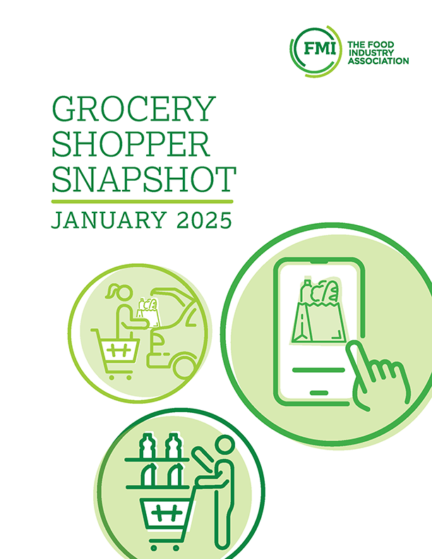
Grocery Shopper Snapshot - January 2025
The Power of In-Store Bakery 2024
The Power of Foodservice at Retail 2024
2024 FreshForward Action Guide
Grocery Shopper Snapshot: Hispanic Edition
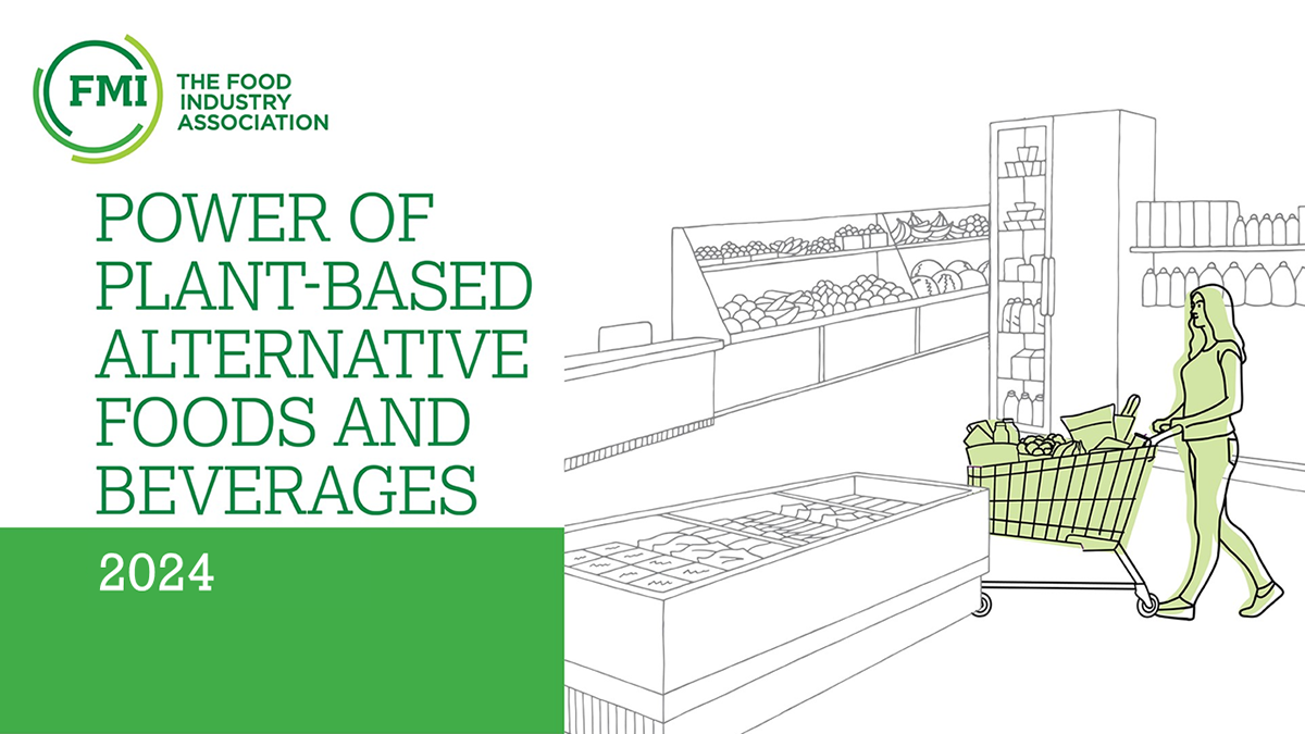
Power of Plant-Based Alternative Foods and Beverages 2024
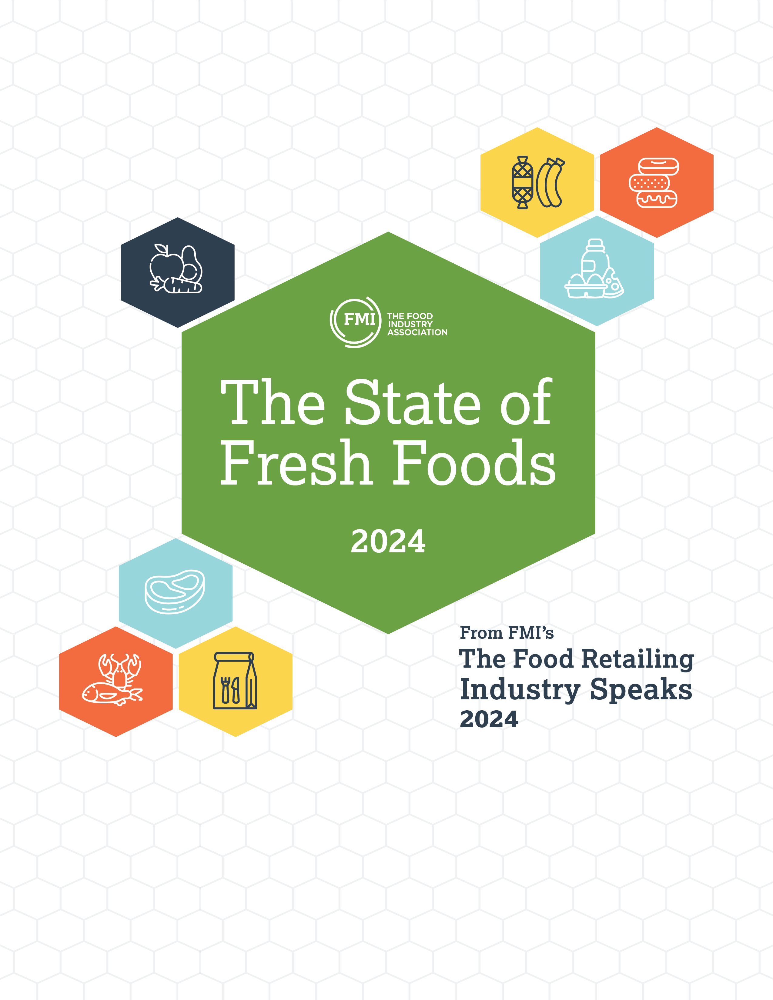
The State of Fresh Foods 2024
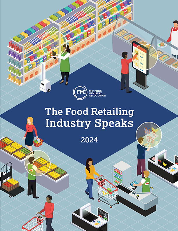
The Food Retailing Industry Speaks 2024
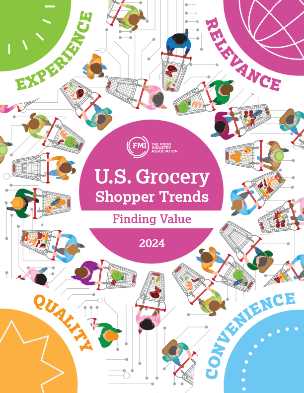
U.S. Grocery Shopper Trends 2024: Finding Value
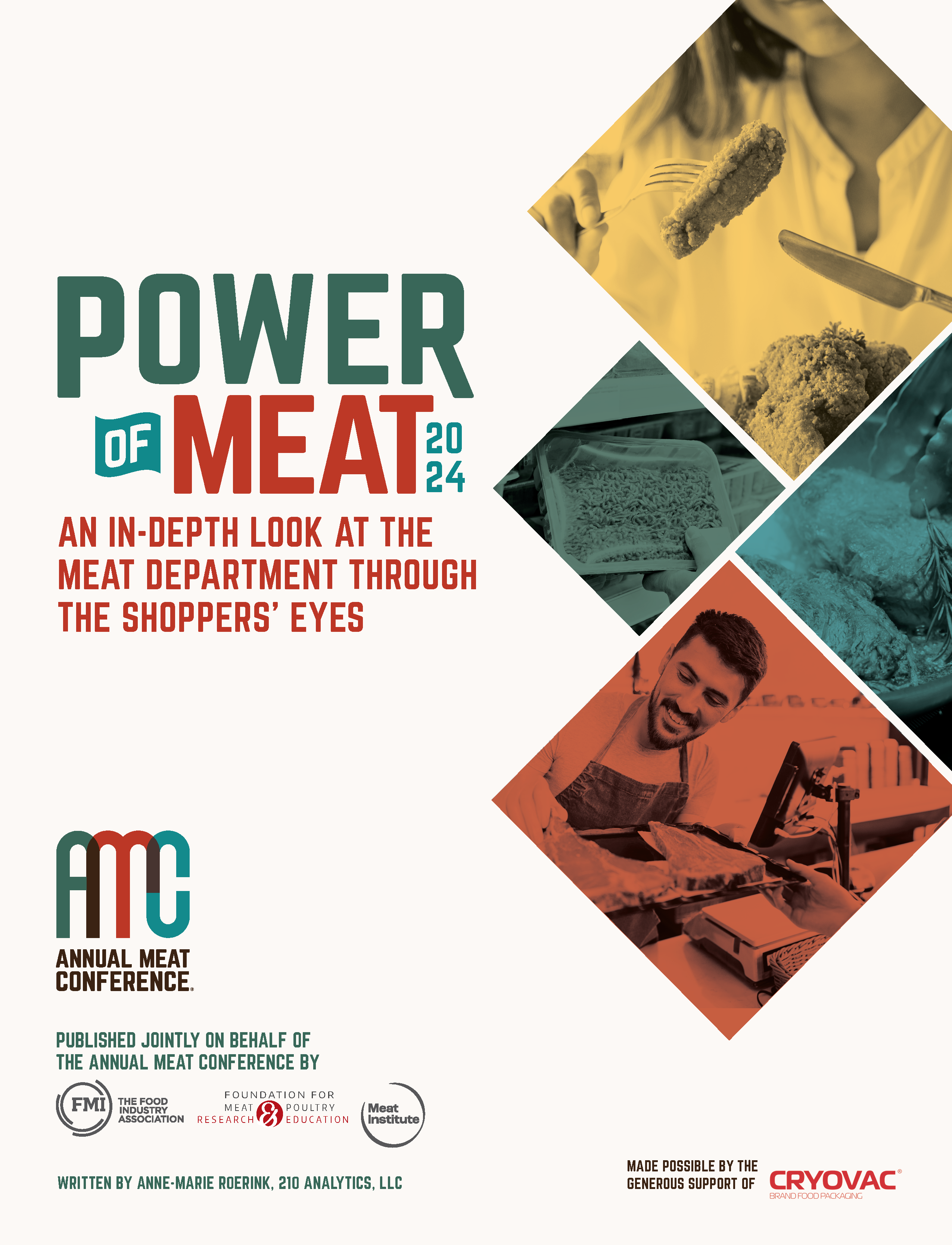
Power of Meat 2024
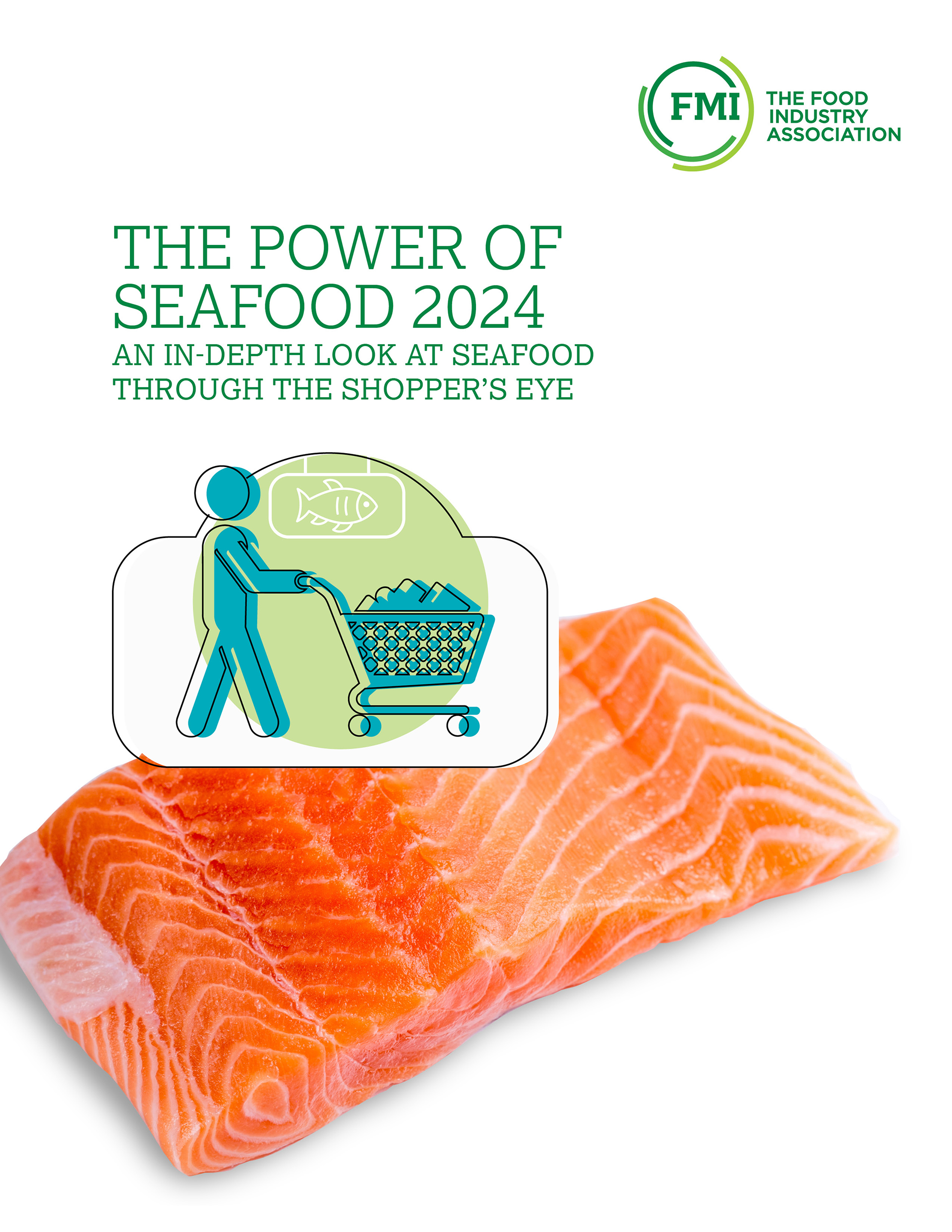
The Power of Seafood 2024
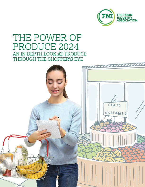
Power of Produce 2024
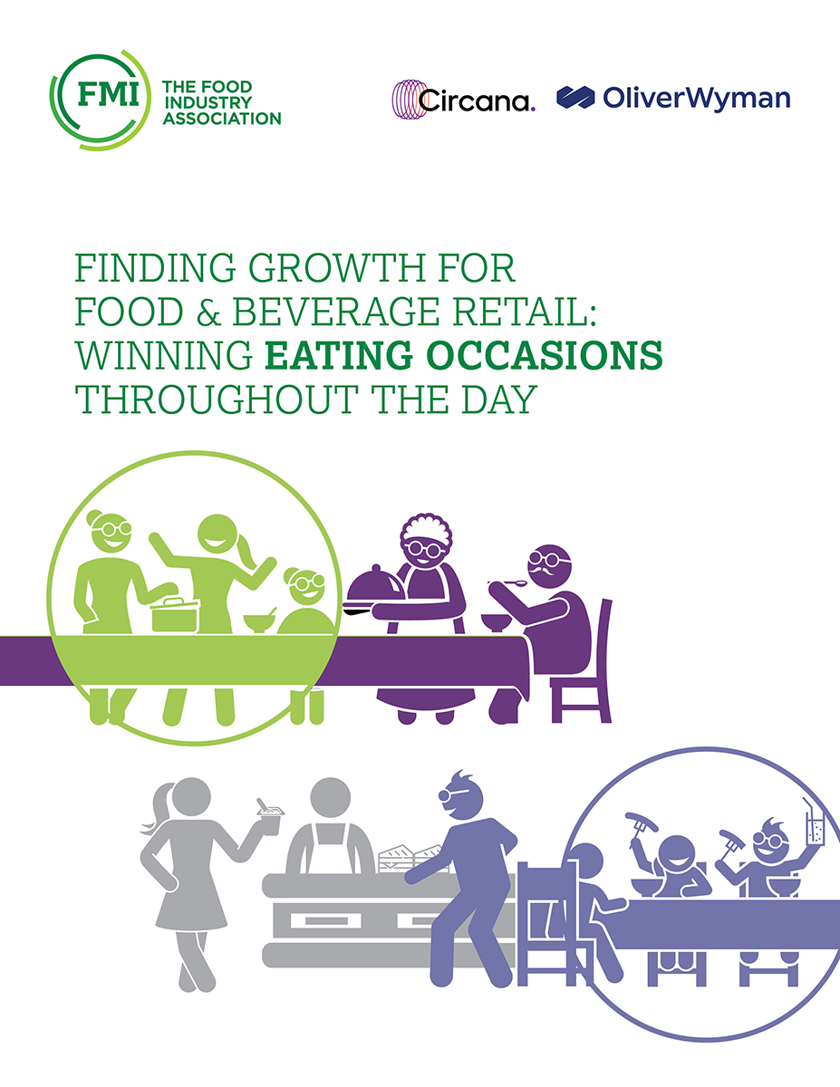
Finding Growth for Food & Beverage Retail:
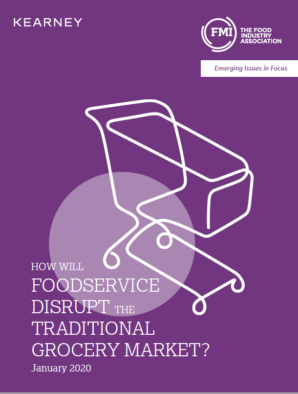
How Will Foodservice Disrupt the Traditional Grocery Market?
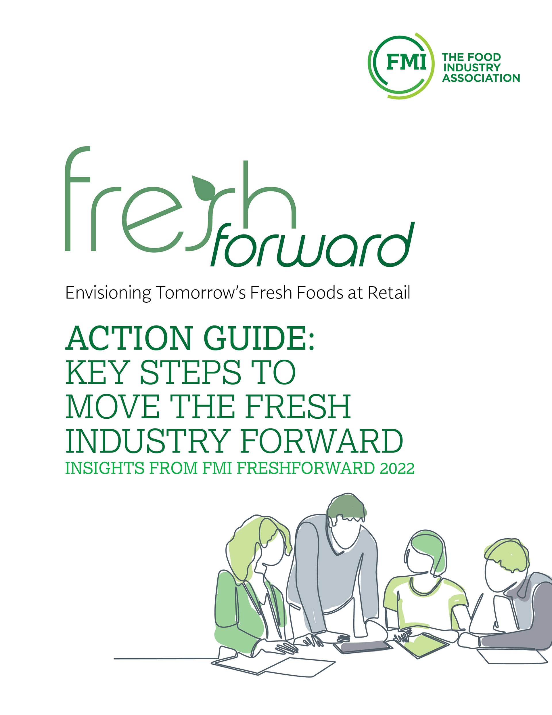
FreshForward Action Guide: Key Steps to Move the Fresh Industry Forward
Forms
Icons
All icon spans must include an "fmi-icon" class in addition to the classes listed below. (e.g. <span class="fmi-icon fmi-icon-calendar"></span>)
Also, if you will be using the icon inline with some text next to it: use a 'spacer-left' or 'spacer-right' class like so:
<span class="fmi-icon fmi-icon-calendar spacer-right"></span> calendarSee all icons
Large Icons
To display a large icon, use a large-icon class on the icon element.
Badge Icon
Add a icon-badge class to an icon to give it a dark circular background.
Section / Page Icons
To edit/add section icons (the green circle with an icon that appears on most pages).
In the admin navigate to Content > Section Icons
Images with Captions

In the Title field of your image, prefix your title with mg-caption: . The caption will be added automatically.
MAXX Categories
Here are the updated IDs for all Categories.
If the category is a "sub category" (i.e. nested under something else), the ID of its parent appears in the third column - otherwise this column says "NULL" and can be ignored. We included this because it is important for determining whether you're looking at the "Training & Development" (ID=20) which is its own top-level category or if you're looking at the "Training & Development" which is nested underneath Education.
| 27 | Nutrition |
| D | Food Safety & Security |
| 12 | Government Relations |
| 13 | Human Resources |
| 20 | Training & Development |
| 14 | Industry Relations |
| 1 | General Marketing & Merchandising |
| 28 | Crisis Management |
| 23 | Financial Management |
| 4B | Energy |
| 5 | Coupons |
| 9 | Sustainability |
| 64 | Education |
| 16 | Meat & Poultry |
| 19 | Produce |
| 1C | Seafood |
| 17 | Consumer Behavior & Trends |
| 18 | Pharmacy |
| 42 | Retail Dietitian |
| 11 | Category Management |
| 8 | Distribution |
| A | Research |
| 3D | Food Waste |
| 2C | Deli / Bakery |
| 47 | Supplier Diversity |
| 2E | Payments |
| 2F | Transportation |
| 30 | SQFI |
| 32 | Asset Protection |
| 51 | Risk Management |
| 52 | Safety |
| 3C | Corporate Social Responsibility |
| 33 | Consumer Affairs |
| 54 | Animal Welfare |
| 65 | Signature Events |
| 57 | Safemark |
| 35 | Health & Wellness |
| 43 | Family Meals |
| 36 | Fresh Foods |
| 37 | Private Brands |
| 38 | Retail Operations |
| 46 | Total Store Collaboration |
| 4C | Packaging |
| 39 | Technology |
| 4E | Digital Shopper |
| 5C | Advertising |
| 5D | Social Media |
| 5E | Loyalty Programs |
| 5F | Communications |
| 60 | Shopper Services |
| 3B | Supply Chain |
| 34 | Cyber Security |
| 3E | Food Fraud |
| 66 | Training & Development |
Add and format new blog sections
Every blog section should consist of two pages: a list page and a detail page - this is necessary because post detail pages use a unique layout. To compose these sections do the following:
- Create a page which will contain the blog posts list. This page can use any page template you'd like.
- Create a page for the detail view and make this page a child of the first blog post list page. For this page use the page template called 2017 View Page. In the page settings - set the page to NOT show in the site navigation.
- On the blog post list page - add a blog posts MVC widget and in list settings select Matrix Blog List for the list template.
- In the single item settings choose the option to open the single item in an existing page - choose the "view" child page you just made.
- On the view page - add a blog posts widet (NOT the MVC one). In the list settings choose Matrix - View Page Blog Posts for the list template.
- In the single items settings choose the open in 'Auto-generated page' option and select 2017 matrix full post for the detail template
Create maxx events sections
- add a 100% layout block and add js-check-content hidden classes to the wrapper. Label this area 'events area'
- add two 100% layout blocks into the layout block from the previous step (these two should be neighbors and not nested within each other)
- add a apply-hero-image class to the wrapper of the first layout block. Label this area 'events heading'
- add banded-bright section-inner classes to the wrapper of the second layout block and add container js-check-me-for-content classes to the Column 1 field. Label this area 'Events widget here'
- add two 100% layout blocks into the 'events heading' area. These should also be neighbors and not nested.
- add hero-image hidden admin-display classes to the wrapper of the first layout block. Label this area 'drop an image widget here'
- add container gutter-top--big classes to the wrapper of the second layout block and add banded padded--more classes in the Column 1 field. Label this area 'events heading'
- insert a 25% / 75% layout block into the 'events heading' area. Make the first column 22% in the widths options. Add divided-columns center-inside classes to the wrapper. add a larger-text class to column 1. Label column 1 'events heading' and label column 2 'events info'
- Add a content block to the 'events heading' area. The html structure should be:
<strong>Category Name</strong>
<div class="largest-text">Events</div>
- Add a content block to the 'events info' area and enter a description for the events.
- Add a maxx event widget to the 'Events widget here' area. In the widget options - add ~/Mvc/Views/mg-events-2017.ascx in the 'LayoutTemplatePath' option. In the 'MaxxCategoryIds' option add a taxonomy ID number if you want to filter events.

Simple events list
- Add a maxx event widget on a page.
- In the widget options - add ~/Mvc/Views/mg-events-2017_simple.ascx in the 'LayoutTemplatePath' option.
Thumbnail lists
- Drop in a list widget to the page, choose 'Expanded list' and select one of the list templates:
- Make sure the list you select only contains an image in the content of the list items.
mg-thumbnail-list--2-across
mg-thumbnail-list--3-across
mg-thumbnail-list--4-across
mg-thumbnail-list--5-across
Matrix - Title, Caption and Content
Matrix - Title and Caption
Linked Title
Sponsor Carousel
Sponsors


Matrix - Title and Caption
Use the caption field for the items' text.
Matrix - Title, Caption and Content
Use the caption field for the items' text.
-
-
Bimbo Bakeries
Bimbo Bakeries USA is a leader in the baking industry, known for its category leading brands, innovative products, freshness and quality. As part of Grupo Bimbo, the world’s largest baking company, BBU is proud to share the company philosophy: Highly Productive and Deeply Humane in the U.S. -
-
-
-
-
-
-
-
Events
- Drag inside a container layout a grid-12 layout.
- On the grid-12 add on the Column field the following class print-hide.
- Drag a content block widget to add the expand all button.
- Drag the Event Widget and click edit.
- Select Events
- on the List Tab check the No limit and Paging and on List Template select Schedule.
- Click on Advance.
- Click on Model
- Change on ContentViewDisplayMode field the value to Automatic
Expand all button:
<p style="text-align:right;"><a class="button-secondary expand-toggle" href="#">Expand All</a></p>
11:00 AM - 7:00 PM
Conference Registration
12:30 PM - 2:00 PM
Pre- Conference Committee Meeting
4:00 PM - 7:00 PM
Manufacturer/Retailer Exchange and Opening Reception
7:00 AM - 6:00 PM
Conference Registration
7:00 AM - 8:00 AM
Breakfast
8:00 AM - 8:15 AM
Conference Welcome with Co-Chairs
Speakers:
- John Lerch - Director, Energy and Facilities, Weis Markets, Inc.
8:15 AM - 9:00 AM
Opening Keynote
9:00 AM - 9:30 AM
Break
9:30 AM - 10:30 AM
General Session
10:30 AM - 10:30 AM
Break
11:00 AM - 12:00 PM
Concurrent Breakout Sessions
- Energy
- Refrigeration
- Store Development
12:00 PM - 1:00 PM
Lunch
1:00 PM - 2:00 PM
Concurrent Breakout Sessions
- Energy
- Refrigeration
- Store Development
2:00 PM - 2:30 PM
Break
2:30 PM - 3:30 PM
General Session
3:30 PM - 6:30 PM
Manufacturer/Retailer Exchange and Reception
7:00 AM - 4:00 PM
Registration
7:30 AM - 8:30 AM
Breakfast
7:30 AM - 8:30 AM
GreenChill Achievement Recognition Ceremony and Breakfast
8:30 AM - 9:30 AM
General Session
9:30 AM - 10:00 AM
Break
10:00 AM - 10:45 AM
General Session
11:00 AM - 12:00 PM
Concurrent Breakout Sessions
- Energy
- Refrigeration
- Store Development
12:00 PM - 1:00 PM
Lunch
1:00 PM - 2:00 PM
Concurrent Breakout Sessions
- Energy
- Refrigeration
- Store Development
2:00 PM - 2:30 PM
Break
2:30 PM - 3:30 PM
Concurrent Breakout Sessions
- Energy
- Refrigeration
- Store Development
3:30 PM - 4:00 PM
Break
4:00 PM - 5:00 PM
Closing Keynote
6:30 PM - 9:30 PM
Off-Site Social Event
7:00 AM - 7:45 AM
Facility and Design Tours Breakfast
8:00 AM - 12:00 PM
Facility and Design Tours
Tours require pre-registration and fee.
We are finalizing locations. Stay tuned for more information.
12:30 PM - 2:00 PM
Post-Conference Committee Meeting
Speakers
- Add a Grid-12 layout inside a container.
- add the class component to the column field.
- Drag the Event Widget and click edit.
- Content Tab: Select the event.
- List Settings Tab: select No limit and paging, on Sort event we recommend "By Title (A-Z) or (Z-A)" and on the List template select Speakers.
- Click the Advance button then Model button.
- On the field ContentViewDisplayMode change it to "Automatic".
- Click save and then save again.

John Lerch
Director, Energy and Facilities, Weis Markets, Inc.- Conference Welcome with Co-Chairs on September 22, 2020 8:00 AM
John Lerch is the Director of Energy and Facilities for Weis Markets, Inc. a regional supermarket chain based in Sunbury, PA with stores located in New York, Pennsylvania, New Jersey, Maryland, Delaware, Virginia, and West Virginia. John is responsible for the energy procurement, facility maintenance, HVAC/ Refrigeration Maintenance, equipment maintenance, and the implementation and execution of energy efficiency and sustainability programs at 200+ stores.